##the variables for each mode were unchanged from 2011-2018
pt <- c("B08301_010") #total using public transportation
bus <- c("B08301_011")
subway <- c("B08301_013")
comm_rail <- c("B08301_014")
trolley <- c("B08301_012")
ferry <- c("B08301_015")
##when we call 2019-2021 ACS data, we will change the following vars
##subway.19 <- c("B08301_012")
##comm_rail.19 <- c("B08301_013")
##trolley.19 <- c("B08301_014")Replicating Erin Davis’ ‘viral map’ with public transit ridership data
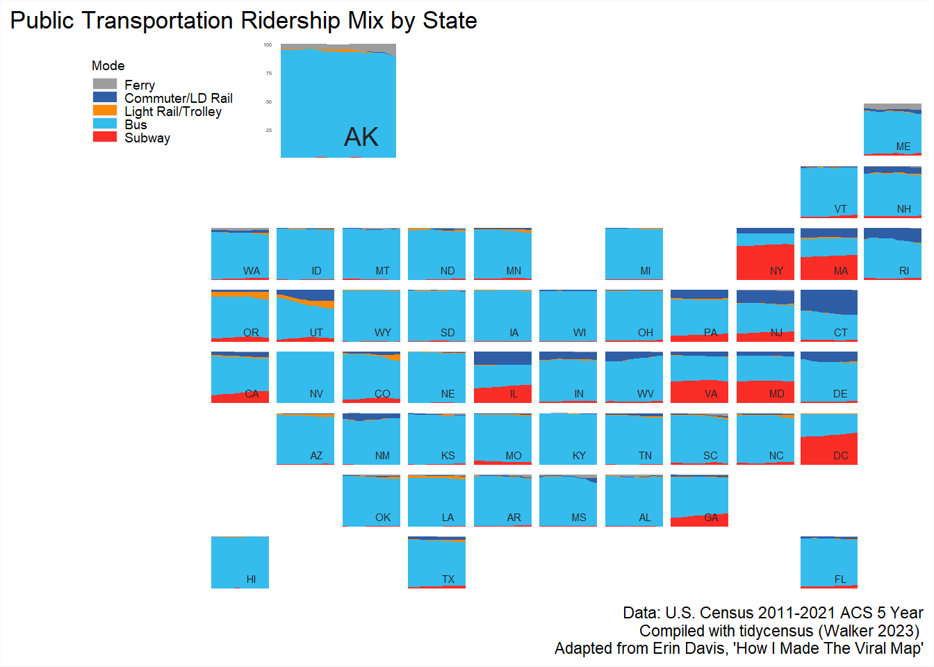
In this vignette, I will adapt Erin Davis’ viral map using public transit ridership data. Using U.S. Census ACS data, we can make a similar map to show how the “ridership mix” in each state has changed from 2011-2021. The ACS collects data in the Transportation to Work universe, capturing which public transit modes use at the tract or block-group level. The ACS has estimates for commuter/long-distance rail, ferry, subway/elevated rail, trolley/streetcar and bus. The first thing we need to do is find and store the unique name variable the Census uses for each mode.
When we call tidycensus for the ACS data, we will rename each variable. We will also include functions to clean the data as well as calculate percentages for each share of each mode. It’s going to look pretty clunky. I will share the first call in the chunk below with commentary.
pt.2021 <- get_acs(geography = "state",
                   variables = c("pt" = pt,
                                 "bus" = bus,
                                 "subway" = "B08301_012", #19-21 ACS used a different variable for these three modes, so I'm not using the stored vars
                                 "comm_rail" = "B08301_013",
                                 "trolley" = "B08301_014",
                                 "ferry" = ferry),
                   year = 2021,
                   survey = "acs5",
                   output = "wide")
We need wide data to easily calculate the new percentage columns (I know no other way!). However, that leads to some clunky cumbersome colnames, some of which we will rename, others will be dropped entirely.
colnames(pt.2021) [1] "GEOID" "NAME" "ptE" "ptM" "busE"
[6] "busM" "subwayE" "subwayM" "comm_railE" "comm_railM"
[11] "trolleyE" "trolleyM" "ferryE" "ferryM" In the next chunk, we store the colnames that we want to drop, calculate new columns, drop the unneeded columns, and finally pivot_longer which will be important for how we construct our plots later.
drop <- c("ptM",
          "busM",
          "comm_railM",
          "subwayM",
          "trolleyM",
          "totpopM",
          "busE",
          "ferryM",
          "ptE",
          "comm_railE",
          "subwayE",
          "trolleyE",
          "ferryE") ##colnames that are soon to leave us
 ##add a year column
pt.2021$year <- 2021
pt.2021 <- pt.2021%>%
  mutate(##calculating new columns - part (mode) / whole (ptE or estimate of total ridership) * 100
    Ferry_Perc = ferryE / ptE * 100,
    Trolley_Perc = trolleyE / ptE * 100,
    Subway_Perc =  subwayE / ptE * 100,
    Comm_Rail_Perc = comm_railE / ptE * 100,
    Bus_Perc = busE / ptE * 100)%>%
  select(!(contains(c(drop))))%>% ##using tidy_select to drop the unwanted columns
  pivot_longer(##pivoting longer for ggplot's sake
    cols = ends_with("_Perc"),
    names_to = "variables",
    values_to = "estimate")
head(pt.2021)
# A tibble: 6 × 5
GEOID NAME year variables estimate
<chr> <chr> <dbl> <chr> <dbl>
1 01 Alabama 2021 Ferry_Perc 2.37
2 01 Alabama 2021 Trolley_Perc 1.76
3 01 Alabama 2021 Subway_Perc 0.310
4 01 Alabama 2021 Comm_Rail_Perc 1.04
5 01 Alabama 2021 Bus_Perc 94.5
6 02 Alaska 2021 Ferry_Perc 11.1 Looks like we were successful. Let’s do this again for 9 more years of data. Wouldn’t it be cool to do this in a function? Maybe one day!
pt.2020 <- get_acs(geography = "state",
                   variables = c("pt" = pt,
                                 "bus" = bus,
                                 "subway" = "B08301_012",
                                 "comm_rail" = "B08301_013",
                                 "trolley" = "B08301_014",
                                 "ferry" = ferry
                                 ),
                   year = 2020,
                   survey = "acs5",
                   output = "wide")
pt.2020$year <- 2020

pt.2020 <- pt.2020 %>%
  mutate(
    Ferry_Perc = ferryE / ptE * 100,
    Trolley_Perc = trolleyE / ptE * 100,
    Subway_Perc =  subwayE / ptE * 100,
    Comm_Rail_Perc = comm_railE / ptE * 100,
    Bus_Perc = busE / ptE * 100
    )%>%
  select(!(contains(c(drop))))%>%
  pivot_longer(
    cols = ends_with("_Perc"),
    names_to = "variables",
    values_to = "estimate")


pt.2019 <- get_acs(geography = "state",
                   variables = c("pt" = pt,
                                 "bus" = bus,
                                 "subway" = "B08301_012",
                                 "comm_rail" = "B08301_013",
                                 "trolley" = "B08301_014",
                                 "ferry" = ferry
                                 ),
                   year = 2019,
                   survey = "acs5",
                   output = "wide")
pt.2019$year <- 2019

pt.2019 <- pt.2019 %>%
  mutate(
    Ferry_Perc = ferryE / ptE * 100,
    Trolley_Perc = trolleyE / ptE * 100,
    Subway_Perc =  subwayE / ptE * 100,
    Comm_Rail_Perc = comm_railE / ptE * 100,
    Bus_Perc = busE / ptE * 100
    )%>%
  select(!(contains(c(drop))))%>%
  pivot_longer(
    cols = ends_with("_Perc"),
    names_to = "variables",
    values_to = "estimate")

pt.2018 <- get_acs(geography = "state",
                   variables = c("pt" = pt,
                                 "bus" = bus,
                                 "subway" = subway, ##from 2018, we can use our stored variables
                                 "comm_rail" = comm_rail,
                                 "trolley" = trolley,
                                 "ferry" = ferry
                                 ),
                   year = 2018,
                   survey = "acs5",
                   output = "wide")
pt.2018$year <- 2018

pt.2018 <- pt.2018 %>%
  mutate(
    Ferry_Perc = ferryE / ptE * 100,
    Trolley_Perc = trolleyE / ptE * 100,
    Subway_Perc =  subwayE / ptE * 100,
    Comm_Rail_Perc = comm_railE / ptE * 100,
    Bus_Perc = busE / ptE * 100
    )%>%
  select(!(contains(c(drop))))%>%
  pivot_longer(
    cols = ends_with("_Perc"),
    names_to = "variables",
    values_to = "estimate")


pt.2017 <- get_acs(geography = "state",
                   variables = c("pt" = pt,
                                 "bus" = bus,
                                 "subway" = subway,
                                 "comm_rail" = comm_rail,
                                 "trolley" = trolley,
                                 "ferry" = ferry
                                 ),
                   year = 2017,
                   survey = "acs5",
                   output = "wide")
pt.2017$year <- 2017

pt.2017 <- pt.2017 %>%
  mutate(
    Ferry_Perc = ferryE / ptE * 100,
    Trolley_Perc = trolleyE / ptE * 100,
    Subway_Perc =  subwayE / ptE * 100,
    Comm_Rail_Perc = comm_railE / ptE * 100,
    Bus_Perc = busE / ptE * 100
    )%>%
  select(!(contains(c(drop))))%>%
  pivot_longer(
    cols = ends_with("_Perc"),
    names_to = "variables",
    values_to = "estimate")


pt.2016 <- get_acs(geography = "state",
                   variables = c("pt" = pt,
                                 "bus" = bus,
                                 "subway" = subway,
                                 "comm_rail" = comm_rail,
                                 "trolley" = trolley,
                                 "ferry" = ferry
                                 ),
                   year = 2016,
                   survey = "acs5",
                   output = "wide")
pt.2016$year <- 2016

pt.2016 <- pt.2016 %>%
  mutate(
    Ferry_Perc = ferryE / ptE * 100,
    Trolley_Perc = trolleyE / ptE * 100,
    Subway_Perc =  subwayE / ptE * 100,
    Comm_Rail_Perc = comm_railE / ptE * 100,
    Bus_Perc = busE / ptE * 100
    )%>%
  select(!(contains(c(drop))))%>%
  pivot_longer(
    cols = ends_with("_Perc"),
    names_to = "variables",
    values_to = "estimate")


pt.2015 <- get_acs(geography = "state",
                   variables = c("pt" = pt,
                                 "bus" = bus,
                                 "subway" = subway,
                                 "comm_rail" = comm_rail,
                                 "trolley" = trolley,
                                 "ferry" = ferry
                                 ),
                   year = 2015,
                   survey = "acs5",
                   output = "wide")
pt.2015$year <- 2015

pt.2015 <- pt.2015 %>%
  mutate(
    Ferry_Perc = ferryE / ptE * 100,
    Trolley_Perc = trolleyE / ptE * 100,
    Subway_Perc =  subwayE / ptE * 100,
    Comm_Rail_Perc = comm_railE / ptE * 100,
    Bus_Perc = busE / ptE * 100
    )%>%
  select(!(contains(c(drop))))%>%
  pivot_longer(
    cols = ends_with("_Perc"),
    names_to = "variables",
    values_to = "estimate")

pt.2014 <- get_acs(geography = "state",
                   variables = c("pt" = pt,
                                 "bus" = bus,
                                 "subway" = subway,
                                 "comm_rail" = comm_rail,
                                 "trolley" = trolley,
                                 "ferry" = ferry
                                 ),
                   year = 2014,
                   survey = "acs5",
                   output = "wide")
pt.2014$year <- 2014

pt.2014 <- pt.2014 %>%
  mutate(
    Ferry_Perc = ferryE / ptE * 100,
    Trolley_Perc = trolleyE / ptE * 100,
    Subway_Perc =  subwayE / ptE * 100,
    Comm_Rail_Perc = comm_railE / ptE * 100,
    Bus_Perc = busE / ptE * 100
    )%>%
  select(!(contains(c(drop))))%>%
  pivot_longer(
    cols = ends_with("_Perc"),
    names_to = "variables",
    values_to = "estimate")

pt.2013 <- get_acs(geography = "state",
                   variables = c("pt" = pt,
                                 "bus" = bus,
                                 "subway" = subway,
                                 "comm_rail" = comm_rail,
                                 "trolley" = trolley,
                                 "ferry" = ferry
                                 ),
                   year = 2013,
                   survey = "acs5",
                   output = "wide")
pt.2013$year <- 2013

pt.2013 <- pt.2013 %>%
  mutate(
    Ferry_Perc = ferryE / ptE * 100,
    Trolley_Perc = trolleyE / ptE * 100,
    Subway_Perc =  subwayE / ptE * 100,
    Comm_Rail_Perc = comm_railE / ptE * 100,
    Bus_Perc = busE / ptE * 100
    )%>%
  select(!(contains(c(drop))))%>%
  pivot_longer(
    cols = ends_with("_Perc"),
    names_to = "variables",
    values_to = "estimate")


pt.2012 <- get_acs(geography = "state",
                   variables = c("pt" = pt,
                                 "bus" = bus,
                                 "subway" = subway,
                                 "comm_rail" = comm_rail,
                                 "trolley" = trolley,
                                 "ferry" = ferry
                                 ),
                   year = 2012,
                   survey = "acs5",
                   output = "wide")
pt.2012$year <- 2012

pt.2012 <- pt.2012 %>%
  mutate(
    Ferry_Perc = ferryE / ptE * 100,
    Trolley_Perc = trolleyE / ptE * 100,
    Subway_Perc =  subwayE / ptE * 100,
    Comm_Rail_Perc = comm_railE / ptE * 100,
    Bus_Perc = busE / ptE * 100
    )%>%
  select(!(contains(c(drop))))%>%
  pivot_longer(
    cols = ends_with("_Perc"),
    names_to = "variables",
    values_to = "estimate")


pt.2011 <- get_acs(geography = "state",
                   variables = c("pt" = pt,
                                 "bus" = bus,
                                 "subway" = subway,
                                 "comm_rail" = comm_rail,
                                 "trolley" = trolley,
                                 "ferry" = ferry
                                 ),
                   year = 2011,
                   survey = "acs5",
                   output = "wide")
pt.2011$year <- 2011

pt.2011 <- pt.2011 %>%
  mutate(
    Ferry_Perc = ferryE / ptE * 100,
    Trolley_Perc = trolleyE / ptE * 100,
    Subway_Perc =  subwayE / ptE * 100,
    Comm_Rail_Perc = comm_railE / ptE * 100,
    Bus_Perc = busE / ptE * 100
    )%>%
  select(!(contains(c(drop))))%>%
  pivot_longer(
    cols = ends_with("_Perc"),
    names_to = "variables",
    values_to = "estimate")
We have a few more cleaning steps left to do, “globally” or on all our new variables. First, we will use rbind to make a long table with a single variable column.
pt.decade <- rbind(pt.2011, pt.2012, pt.2013, pt.2014, pt.2015, pt.2016, pt.2017, pt.2018, pt.2019, pt.2020, pt.2021)In the next chunk, we filter to remove Puerto Rico, drop decimals with round() and then add a column with two-letter state abbreviations to make our final plot look oh-so nice.
#remove PR
pt.decade <- pt.decade %>%
  filter(GEOID < 70)

#drop everything from the hundreds place on
pt.decade$estimate <- round(pt.decade$estimate, digits = 1)

#add abreviations
abbs <- tibble(NAME = state.name)%>% ##state.name and .abb are handy base r functions!
  bind_cols(tibble(abb = state.abb)) %>%
  bind_rows(tibble(NAME = "District of Columbia", abb = "DC")) ##but they don't include DC?
pt.decade <- left_join(pt.decade, abbs, by = "NAME")
In the next chunk, we store some variables which will be useful when we start plotting.
##limits for x and y axes
firstyear <- 2011
lastyear <- 2021

#titles are cool
plottitle <- 'Public Transportation Ridership Mix by State'


#making a new column called Mode that will also refactor the variables in the way we want them to appear in the plot
pt.decade$Mode <- factor(pt.decade$variables, levels=c("Ferry_Perc",
                                                    "Comm_Rail_Perc",
                                                       "Trolley_Perc",
                                                       "Bus_Perc",
                                                       "Subway_Perc"))


#storing the colors we want for each mode
colors <- c("Ferry_Perc" = "#9d9d9d",
            "Comm_Rail_Perc" = "#2f5da6",
            "Trolley_Perc" = "#fd8a03",
            "Bus_Perc" = "#36bbed",
            "Subway_Perc" = "#fa2d27"
)

#going to use this variable to rename our legend items
modes<-c("Ferry",
      "Commuter/LD Rail",
      "Light Rail/Trolley",
      "Bus",
      "Subway")
In the next chunk, we will make a test plot which will double as our legend. We will use Alaska, a clever move by Davis.
legend_AK <- ggplot(data = subset(pt.decade, NAME == 'Alaska'), aes(x = year, y = estimate, fill = Mode, group = Mode)) +
  geom_area()+
  annotate("text", x = 2018, y = 20,
           label = "AK",
           size = 5,
           colour = "#222222")+
  scale_fill_manual(values = colors,
                    labels = modes) +
  scale_x_continuous(limits = c(firstyear, lastyear), expand = c(0,0))+
  scale_y_continuous(limits = c(0, 101),
                     expand = c(0, 0),
                     breaks = c(25, 50, 75, 100)) +
      theme(legend.position = 'left',
      legend.key.height = unit(.25, 'cm'),
      legend.key.width = unit(.5, 'cm'),
      legend.text = element_text(size = 7),
      legend.title = element_text(size = 7),
      aspect.ratio=1,
      panel.background = element_rect(fill = '#efefef', color = '#f6f6f6'),
      axis.title = element_blank(),
      axis.ticks = element_blank(),
      axis.text.y = element_text(size = 2.5,
                                 colour = "#222222"),
      axis.text.x = element_blank(),
      plot.margin = grid::unit(c(0,0,0,0), "mm"))
legend_AK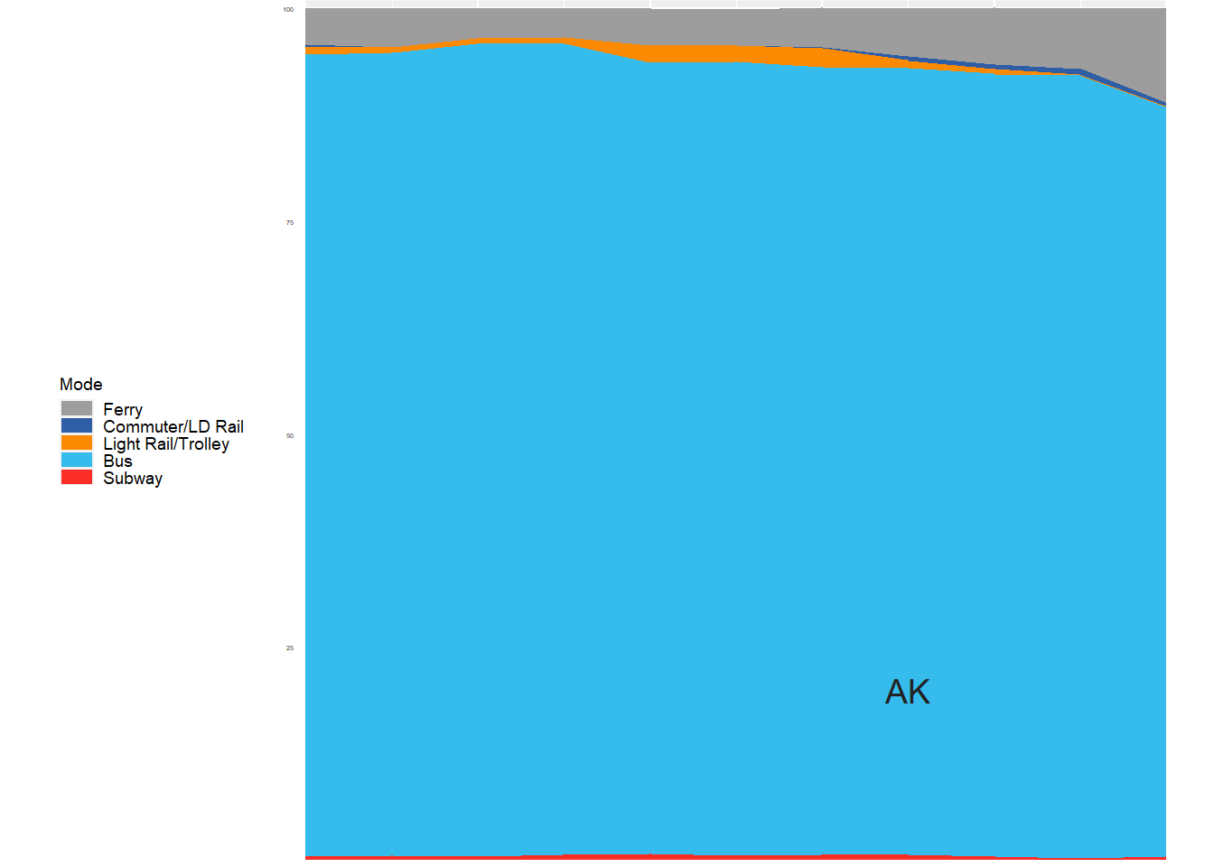
Pretty cool! I have no idea who is commuting to work in Alaska by subway or light rail. Congresspeople? Alaskan-New Yorkers?
Next up, we have a function that comes pretty much line-by-line from Davis. It makes a list of all the unique values in the abb column then plugs each value into the function, spitting out a plot for all 50 states plus D.C.
states <- unique(pt.decade$abb) # get the unique state names
states <- states[!grepl('AK', states)] # not using filter, because this is a list

for (i in 1:length(states)) {
  plot <- ggplot(subset(pt.decade, abb == states[i]),
                 aes(x = year, y = estimate,
                     fill = Mode, group = Mode)) +
    theme_map() +
    geom_area() +
    annotate("text", x = 2018, y = 20,
             label = states[i],
             size = 2,
             colour = "#222222") +
    scale_fill_manual(values = colors) +
    scale_x_continuous(limits = c(firstyear, lastyear), expand = c(0, 0)) +
    scale_y_continuous(limits = c(0, 100.9))+
    theme(legend.position = 'none',
          aspect.ratio=1,
          #panel.background =  element_rect(fill = '#efefef', color = '#f6f6f6'),
          axis.text.y = element_blank(),
          axis.text.x = element_blank(),
          plot.margin=grid::unit(c(0,0,0,0), "mm"))
  assign(states[i], plot)
  remove(plot)
}
OK #print a test plot
The OKC Streetcar went live in 2018, and you can see that right here, where the orange line goes real wide.
There’s really nothing left to do but make a layout and create a patchwork object. Once again, this comes nearly line by line from Davis. She has a great explanation of how this layout works on the post linked above.
layout<-c(
    area(1,1,2,4),
  area(2,11),
  area(3,10),area(3,11),
  area(4,1),area(4,2),area(4,3),area(4,4),area(4,5),
  area(4,7),area(4,9),area(4,10),area(4,11),
  area(5,1),area(5,2),area(5,3),area(5,4),area(5,5),
  area(5,6),area(5,7),area(5,8),area(5,9),area(5,10),
  area(6,1),area(6,2),area(6,3),area(6,4),area(6,5),
  area(6,6),area(6,7),area(6,8),area(6,9),area(6,10),
  area(7,2),area(7,3),area(7,4),area(7,5),area(7,6),
  area(7,7),area(7,8),area(7,9),area(7,10),
  area(8,3),area(8,4),area(8,5),area(8,6),area(8,7),area(8,8),
  area(9,1),area(9,4),area(9,10)
)

finalplot <- wrap_plots(legend_AK,
                        ME, VT, NH, WA, ID, MT, ND, MN, MI, NY, MA, RI,
                        OR, UT, WY, SD, IA, WI, OH, PA, NJ, CT,
                        CA, NV, CO, NE, IL, IN, WV, VA, MD, DE,
                        AZ, NM, KS, MO, KY, TN, SC, NC, DC,
                        OK, LA, AR, MS, AL, GA, HI, TX, FL,
                        design = layout) &
 #rather than use ggplot for the title, I'm using patchwork's annotation functions
  plot_annotation(title = plottitle,
                  caption = "Data: U.S. Census 2011-2021 ACS 5 Year
                                Compiled with tidycensus (Walker 2023)
                                Adapted from Erin Davis, 'How I Made The Viral Map'",
                  theme = theme(plot.background = element_rect(color  = '#f8f8f8')))
finalplot