Mapping Fare Collection at U.S. Transit Agencies
This project builds on my thesis research about the adoption of new fare collection technology by transit agencies in the U.S. The goal was to create a cartographic product that could illustrate some of the study background – that is, the variegated landscape of transit fare collection in the U.S. But in a larger sense, this project is about getting intimate with data: inspecting, cleaning, joining and representing it.
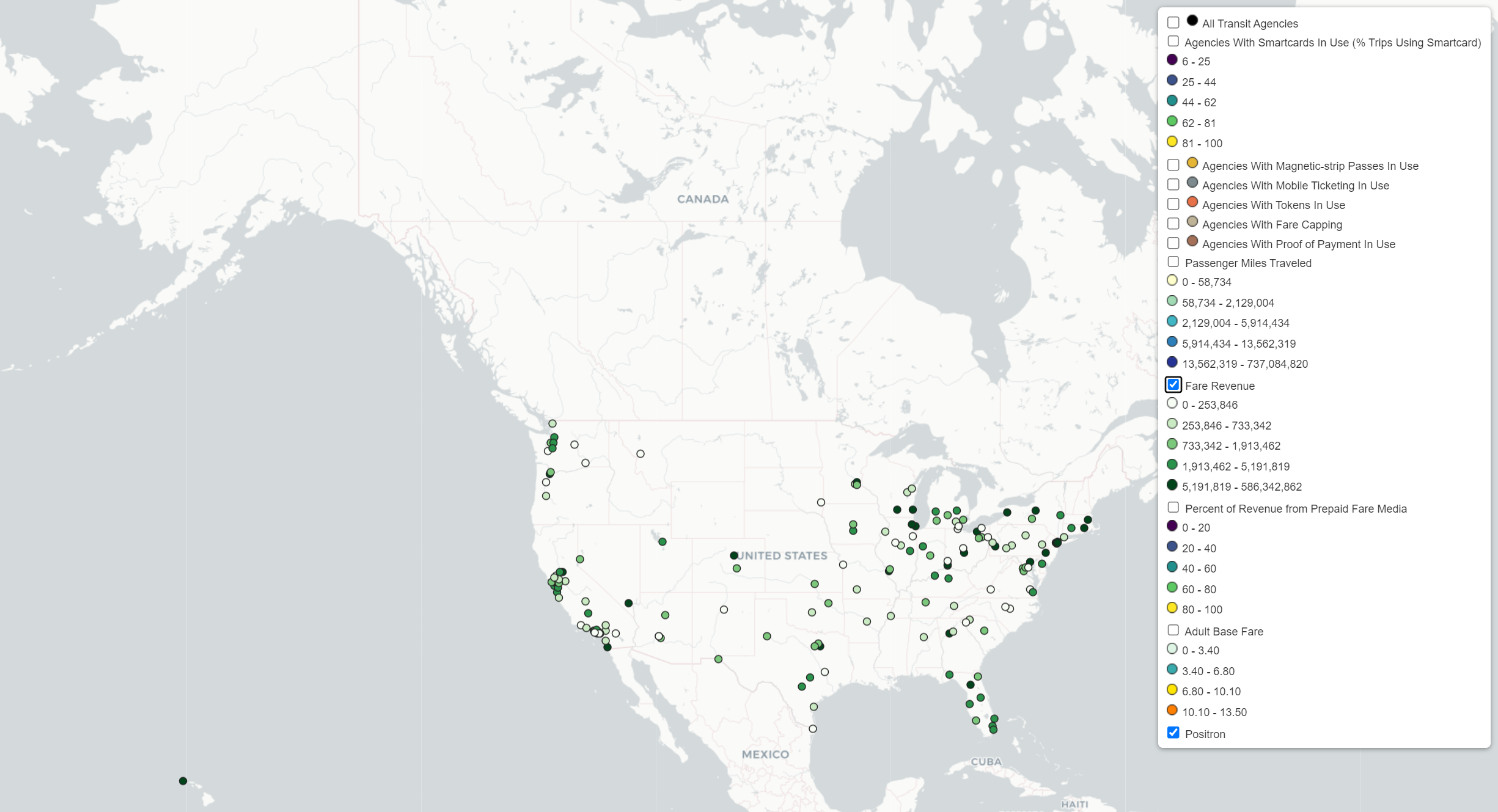
I started with a simple goal: to map the fare collection modes in use at transit agencies in the U.S. Where are tokens still used? How widespread are smartcards? Is mobile ticketing taking over? The map could illustrate trends I saw in the course of my thesis research. Smartcards, while expensive, helped facilitate interoperability of transit agencies operating in the same metropolitan region. Mobile ticketing applications were cheap and fast to implement by agencies of all sizes. Non-digitized fare payment media were on the way out. These could be mapped alongside key performance measures like annual ridership, annual revenue, and annual operating costs. The task turned out to be more complex than initially imagined. The final map represents just the tip of the iceberg, below which lie a number of data cleaning and manipulation tasks.
To view the map, click the screenshot below. Check out a vignette of working with the data behind the map here.